What is ADA Compliance & Why It Matters
ADA-Compliant WordPress Site
Imagine visiting a website and not being able to read the text or use the navigation menu. That’s what millions of people with disabilities experience every day.
ADA compliance is about making sure your website works for everyone. It’s tied to the Americans with Disabilities Act, which means sites that don’t comply can face legal trouble. But beyond that? It’s just the right thing to do.
If you’re using WordPress, you’re in luck. It’s one of the easiest platforms to work with when it comes to building accessible sites. This guide will walk you through practical steps—no fluff, no jargon.
Understanding ADA Compliance and WCAG Standards
So, what do you actually need to do?
The ADA doesn’t list out specific web rules. But that’s where WCAG (Web Content Accessibility Guidelines) steps in. Think of WCAG as your website’s accessibility blueprint.
These guidelines are grouped into four big ideas: Perceivable, Operable, Understandable, and Robust. Sounds techy? Don’t worry. We’ll break it down simply as we go.
Step 1: Start with an Accessible Theme
Not all themes are created equal. Some look great but are a nightmare for screen readers.
Pick a theme that’s labeled “accessibility-ready” in the WordPress repository. That means it’s built with accessibility in mind—like proper heading structures, contrast, and keyboard support. I once installed a gorgeous theme only to realize my keyboard couldn’t reach half the menu. Lesson learned.
Step 2: Use Proper Heading Structure and Semantic HTML

Headings aren’t just about style. They help users navigate your content.
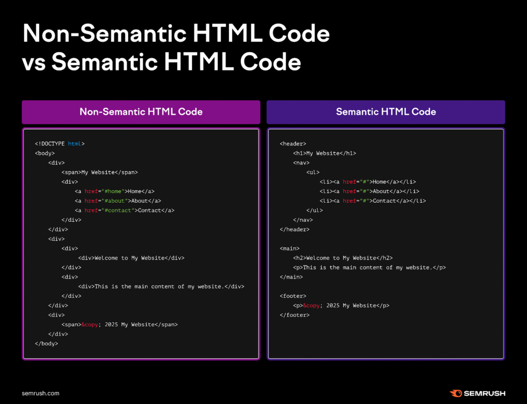
Screen readers use heading levels like a table of contents. If you jump from an H1 straight to an H4, it’s like skipping chapters in a book. Stick to H1 for your main title, H2 for sections, H3 for subsections. And use semantic HTML elements—like <nav> for navigation, <footer> for your site’s bottom area, and so on.
Proper heading structure and semantic HTML:
<!DOCTYPE html>
<html lang="en">
<head>
<meta charset="UTF-8">
<title>Semantic HTML Example</title>
</head>
<body>
<header>
<h1>My Personal Blog</h1>
<nav>
<ul>
<li><a href="#home">Home</a></li>
<li><a href="#about">About</a></li>
<li><a href="#contact">Contact</a></li>
</ul>
</nav>
</header>
<main>
<article>
<h2>Welcome to My Blog</h2>
<section>
<h3>Introduction</h3>
<p>This is where I share my thoughts on web development and design.</p>
</section>
<section>
<h3>Latest Post</h3>
<p>Today we explore how to use semantic HTML for better accessibility and SEO.</p>
</section>
</article>
</main>
<aside>
<h2>Recent Posts</h2>
<ul>
<li><a href="#">Using Flexbox</a></li>
<li><a href="#">HTML5 Tips</a></li>
</ul>
</aside>
<footer>
<p>© 2025 My Personal Blog. All rights reserved.</p>
</footer>
</body>
</html>
Step 3: Add Descriptive Alt Text to All Images

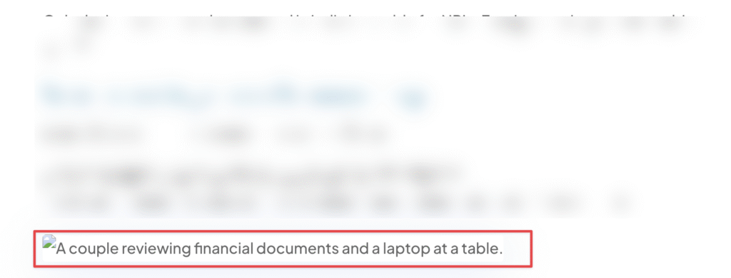
Every image needs an alt description. Not for SEO—but for humans.
Imagine reading a product page and all it says is “image1.jpg.” That tells you nothing. Instead, describe what the image shows. Keep it simple: “Smiling woman using a screen reader on her laptop.” That paints a picture.
Some users don’t use a mouse. They use a keyboard.
So your site should be fully navigable with just the Tab, Enter, and Arrow keys. This includes your menus, modals, pop-ups, and forms. Try it yourself—open your site and put your mouse aside. Can you access everything?
If not, it’s time for fixes.
Step 5: Install Accessibility-Focused Plugins

Plugins can help—but they aren’t magic.
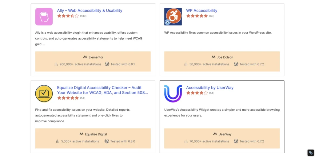
Install tools like WP Accessibility, One Click Accessibility, or Accessibility Checker. These plugins add helpful features like skip links, outline focus, and accessibility audits. But remember: they’re helpers, not replacements.
Step 6: Check Color Contrast and Visual Clarity
Colors matter. A lot.
If your text blends into the background, it’s unreadable for people with vision impairments. Use tools like WebAIM Contrast Checker to test your color combos. Aim for strong contrast and avoid relying on color alone to convey meaning.
Step 7: Use ARIA Labels and Landmarks Wisely
ARIA sounds fancy, but it just means giving extra labels to your site’s elements.
They help screen readers understand what things do—like marking a section as a “navigation” or identifying buttons. But don’t overdo it. Too much ARIA can confuse rather than help.
Stick to the basics. Only use ARIA when HTML alone can’t get the job done.
Step 8: Provide Captions and Transcripts for Multimedia
Got videos or podcasts? You need captions and transcripts.
I once uploaded a tutorial video without captions. A viewer messaged me, saying they were deaf and couldn’t follow along. That hit hard. Since then, I always upload transcripts and use tools like YouTube auto-captioning (and edit them!) to make sure everyone gets the message.
Step 9: Test Your Website with Accessibility Tools
No guesswork. Use tools.
Try WAVE, axe DevTools, or Lighthouse. These tools scan your site and point out issues—missing labels, poor contrast, bad heading structure. It’s like having an accessibility checklist built into your browser.
Step 10: Maintain Compliance Over Time
Don’t treat accessibility like a one-time job.
Every plugin you install, every theme update, every blog post… it all needs a quick accessibility check. Add it to your publishing checklist. It’s easier to fix small issues now than get hit with a lawsuit later.
Recommended Accessibility Tools & Plugins
- WP Accessibility – Adds skip links, language attributes, and more
- One Click Accessibility – Simple toggles for visual enhancements
- Accessibility Checker by Equalize Digital – Real-time scanning of posts and pages
- Lighthouse (Chrome DevTools) – Built-in accessibility audit
- axe DevTools – Powerful browser extension for testing
- WebAIM Contrast Checker – Test background/text color contrast
Common Accessibility Mistakes to Avoid
- Missing image alt text
- Improper heading order (H3 before H2? Nope.)
- Low contrast text
- No keyboard access for dropdowns or modals
- Forms without labels or error messages
- Only using color to indicate changes
If your contact form turns red when there’s an error… that’s not enough. Add text too.
Conclusion
Accessibility isn’t just a checklist. It’s a mindset.
When you build with everyone in mind, your site becomes easier to use, more inclusive, and legally safer. Plus, search engines love accessible sites.
Start small. Take it step by step. Fix what you can today.
Font Awesome CDN
Divi Theme Options Integration code
